Simplify UI / remove clutter?
I would love a more simple UI (with a focus on UX) - don’t know if it is planned to revamp it?
describe user-journeys / user-flows in the app - and optimize those to least friction :-)
i spend a lot of time navigating unnecessary in the app.
in the old version when swapping app while in map-mode and then swap back to 27crags it would forget the zoom level/position on the map.
when you have the topo-list on the old-app and you go to look at a boulder - you cannot go back to the topo-list (you end on the boulder-list view if you go back - cannot go back to the sorted list topo list of the crag)
these two “bugs”/features is what bugs me most from a user perspective in the old 27crags app :-)
* longer post warning *
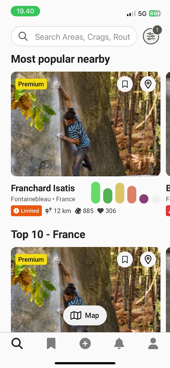
search/frontpage seems ok UX wise. not too much clutter - and lets you find crags and problems as well as discover nearby.
maybe missing some indicator if you have any todo’s in that crag?
maybe missing icon to go directly to topo’s for that crag (and skip the crag detail view)
maybe missing a “i” icon you can press to read the crag description without going to crag detail view?
maybe move more icons into the image? (“limited”, distance, number of boulders and likes - there is already premium, bookmark and location icons in the image)
i think bookmark tab is too much space/prominent if it is only for “bookmarked crags”?…. while todo lists have very little prominence on the main screen. (unless it will be integrated in the bookmark tab? - like you can bookmark crags, and then see your todo’s grouped by those crags in the “bookmark” tab in the main screen - that could be useful :-)
++++++++++++++++++++++++++++++++++++++
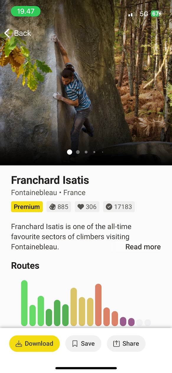
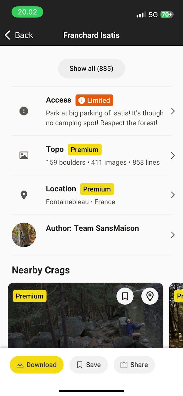
the crag view:
i think personally there is way too much information here.
and repeated information (location, topo/number-of-boulders)
what i think is important on this screen is a quick way to get to the topo or map.
quick way to navigate to parking
and maybe info if there is some access restrictions.
i usually just click “show all” to go to the topos (and not really using the view - could be skipped)
or more often try to get the map of the crag (should be some icon or button to go directly to it)
not useful for me:
the big bar-chart of boulders by grade (or could be the smaller one from the crag-cards)
author
location (double)
topo line (double)
maybe some information/details/stats could be hidden and only shown when you press a “i” button?
what is the difference from “save” or “download” (in the old app you could download and it would go to the offline list, you could also bookmark, but it didn’t really do anything i think?) why have both? :-)
when you “share” a crag og boulder you should be able to deep-link it in the app.
“download, save and share button” have a very prominent position in the fixed button view there - i would not put them there (if i should have something fixed it would be “map”, “topo” and maybe “parking”) - but would prefer no fixed bar there - or the general fixed bar from the frontpage instead!
+++++++++++++++++++++++++++++++++++++++++++++++++++
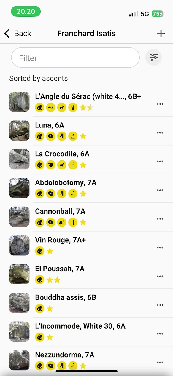
topo list (after pressing “show all” on the crag)
i would like any todo’s from my todo list to be pin’ed at top.
and be able to specify/remember a default sort (i usually sort by most ascents to see what is popular)
in the old app if you went in to a problem and then pressed back - the app would go to the boulder and not the full list (it should go real “back” ie. to the full list)
if i press a boulder on the topo list - i would like to go to the problem detail view - not the boulder-view (the way it works in the web version - and then you should have a button or something to view other problems on that boulder from the detail view)
i like the compact view of each line with image, name, grade and icons.
if adding anything: some sort of popularity indicator?, or if there is video beta?
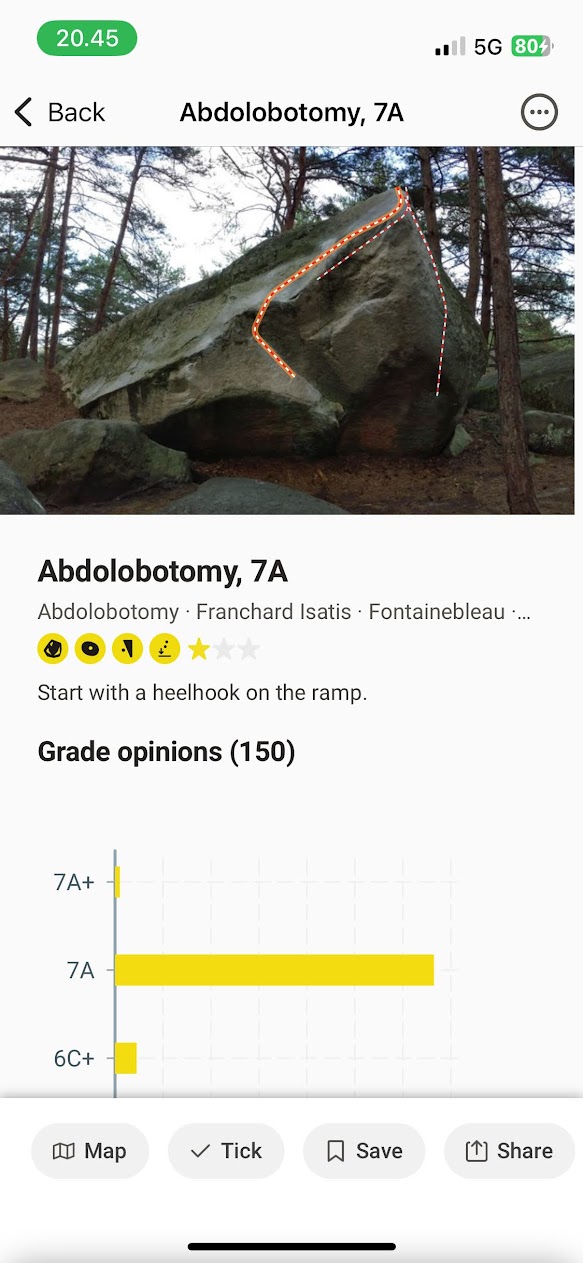
the problem detail view
the topo image is only 1/3 of the view?!? i would make it as big as possible! 2/3 or 3/4!
maybe the topo images are made for web/laptop 16/9 format? it just doesnt work so well on mobile with that aspect ratio :-/
this particular problem/photo could be cropped to fit a mobile screen much better.
the grade opinions chart is so huge! (and that data could be shown in a much more compact style i guess - maybe some sort of sandbag indicator instead?)
as someone else also said the actual line needs more highligtning vs. the other lines on the boulder.
there should be some sort of navigation/button to get to the other problems on the boulder (maybe just pressing “abolotomy” text under the title as i guess that’s the boulder name.
there should be an indicator if it is already on my todo list (or if already ticked)
title and grade is repeated (above image, and under image) too much?
again i think the bottom fixed bar should not be there - or it should be the general one which is always the same from the main page.
map, tick, save, share could be integrated in the page.
+++++++++++++++++++++++++++++++++++++
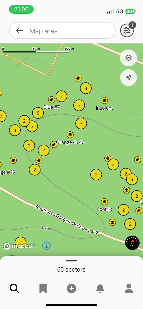
map view (seems to be crag-explorer view?) make it a crag-detail-map-view too?
maybe prioritize “popular” boulders to show their names on more zoom levels if not space for them otherwise?
the filter seems to be just for crags.
i would like some quick-access filters for instance “popular”, “todo-list”, “ticked” where i don’t have to open a filter and adjust things.
i would like to see the boulders from my todo list highlighted (or maybe just a quick-access filter)
i like that there is now a indicator that shows the direction my phone points at on the map! :-)
Please authenticate to join the conversation.
In Review
💡 Feature Request
Home
Almost 2 years ago

jensda
Subscribe to post
Get notified by email when there are changes.
In Review
💡 Feature Request
Home
Almost 2 years ago
jensda
Subscribe to post
Get notified by email when there are changes.