Make Ui scale properly with smaller screens
Ui scales poorly for smaller screens. See screenshots for reference:
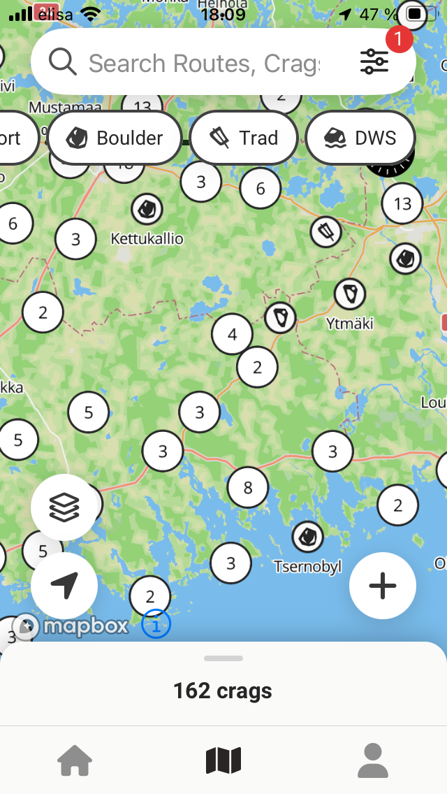
Lots of clutter on the map view, top and bottom elements taking a lot of screen estate. Removing filters and making bottom element smaller could help.
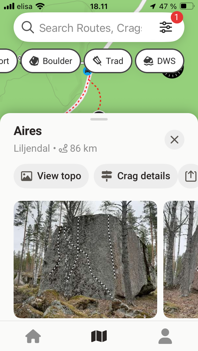
Map is almost useless with this view. Maybe just go full screen with the sector info?
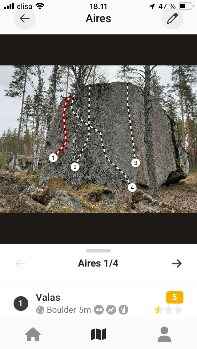
There is not enough room to show route name and info at the same time. Smaller image & buttons the bottom would fix this.
Device: iphone se (2nd gen), ios 18.6.2
Please authenticate to join the conversation.
Upvoters
Status
Planned
Board
💡 Feature Request
Tags
Other
Date
11 months ago
Author

Jarkko Rahikainen
Subscribe to post
Get notified by email when there are changes.
Upvoters
Status
Planned
Board
💡 Feature Request
Tags
Other
Date
11 months ago
Author
Jarkko Rahikainen
Subscribe to post
Get notified by email when there are changes.