Area location map view is very hard to use
Map view that you are getting after taping on the Location on the area page is very awkward to use.
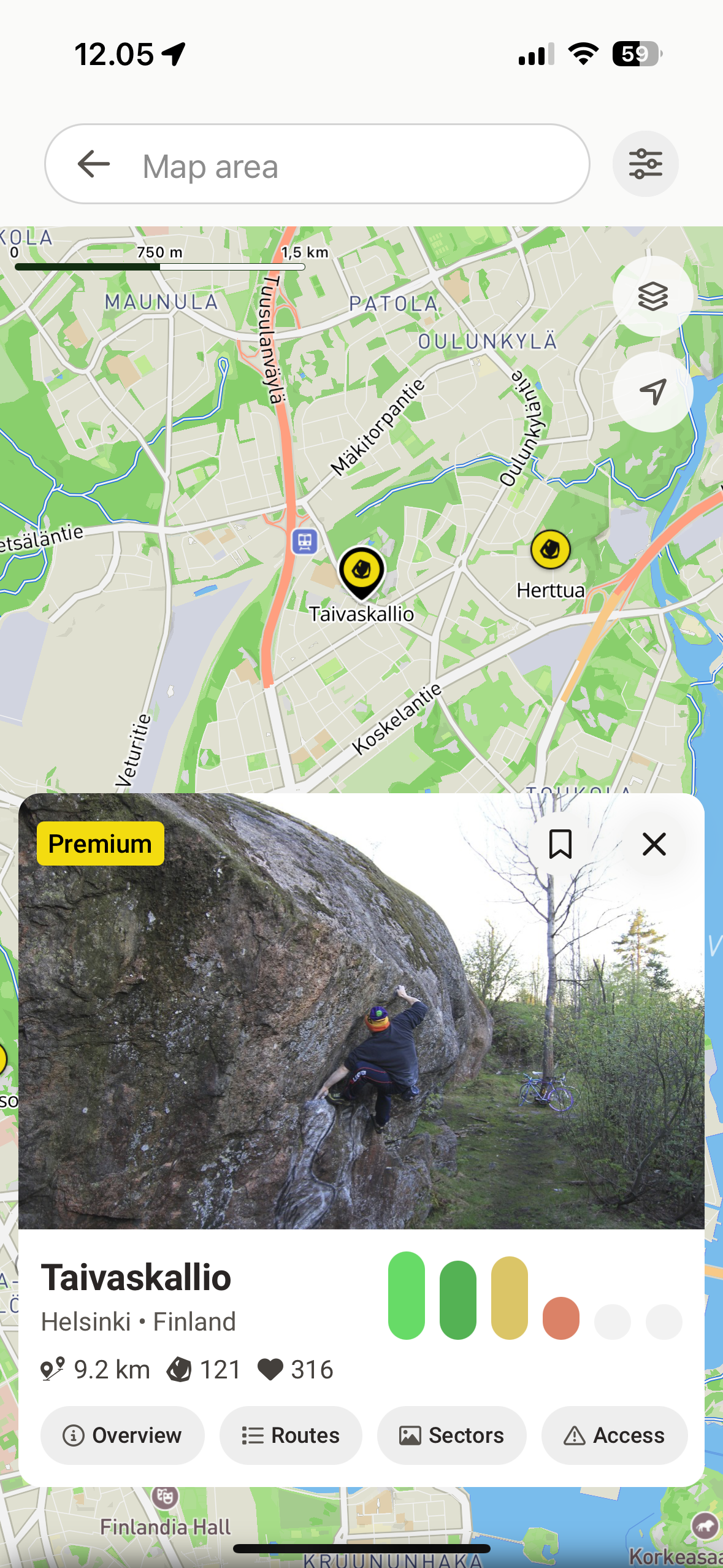
Most of the screen area is covered with search input and card with area description (considering that you just case from area page this seems to be an excessive information here), while you have very small area to interact with the map. First thing that comes to your mind is to close the card, but that leads to current state reset and you lose highlighted pin of the area you are exploring. Sometime pin of the area disappears at all.
Issues to address:
Map area is too small in this view.
Closing card leads to unexpected loss of focus on the area you are exploring and causing you to start flow from the very beginning.
Possible solutions:
a. Make card description smaller so user can interact with a map and get back to the area info quickly if needed.
b. Make it collapsable (e.g. replace close icon with collapse ‘⌄‘) that will squeeze card to collapsed state.
Example:
Please authenticate to join the conversation.
In Review
💡 Feature Request
Map
Over 1 year ago

Alex Ivanou
Subscribe to post
Get notified by email when there are changes.
In Review
💡 Feature Request
Map
Over 1 year ago
Alex Ivanou
Subscribe to post
Get notified by email when there are changes.